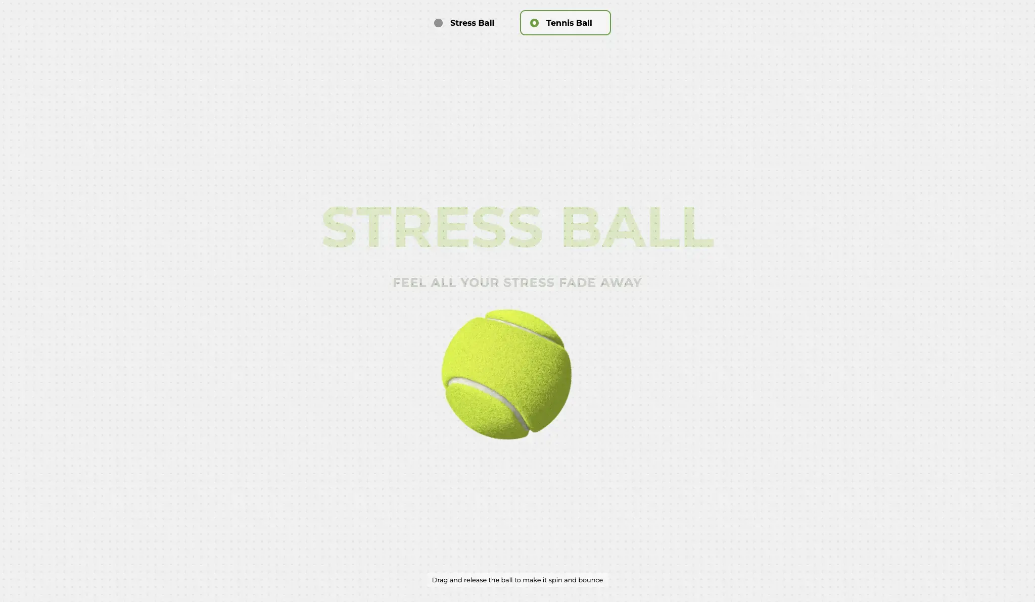
Concept: An interactive web component that visually mimics a squishy stress-ball. When the user hovers or clicks, CSS transitions deform the circle using border-radius, transform: scale(), and subtle gradients to create a tactile, “squeezed” effect. Release restores the perfect sphere with a spring-back animation driven by transition-timing-function: cubic-bezier(...). The demo works in all modern browsers, is fully responsive, and weighs under 5 KB—ideal for embedding or teaching beginner-level CSS animation techniques.
Key learning points:
| Goal | Technique |
|---|---|
| Realistic squish | Layered radial-gradient background, animated border-radius |
| Spring-back feel | Custom cubic-bezier easing & transition-delay |
| Accessibility | aria-pressed toggled via :active, high-contrast fallback |
| Performance | GPU-friendly transforms only; no layout thrash |
| Last Update | 12 Sep, 2025 |
| Created | 18 May, 2025 |
| Technology Used | Html Css Javascript |
| Compatible With | Any Browser |
| Documentation | No |
| Layout | Responsive |
| Total Download | 21 |
| Total Views | 93 |
| Tags |