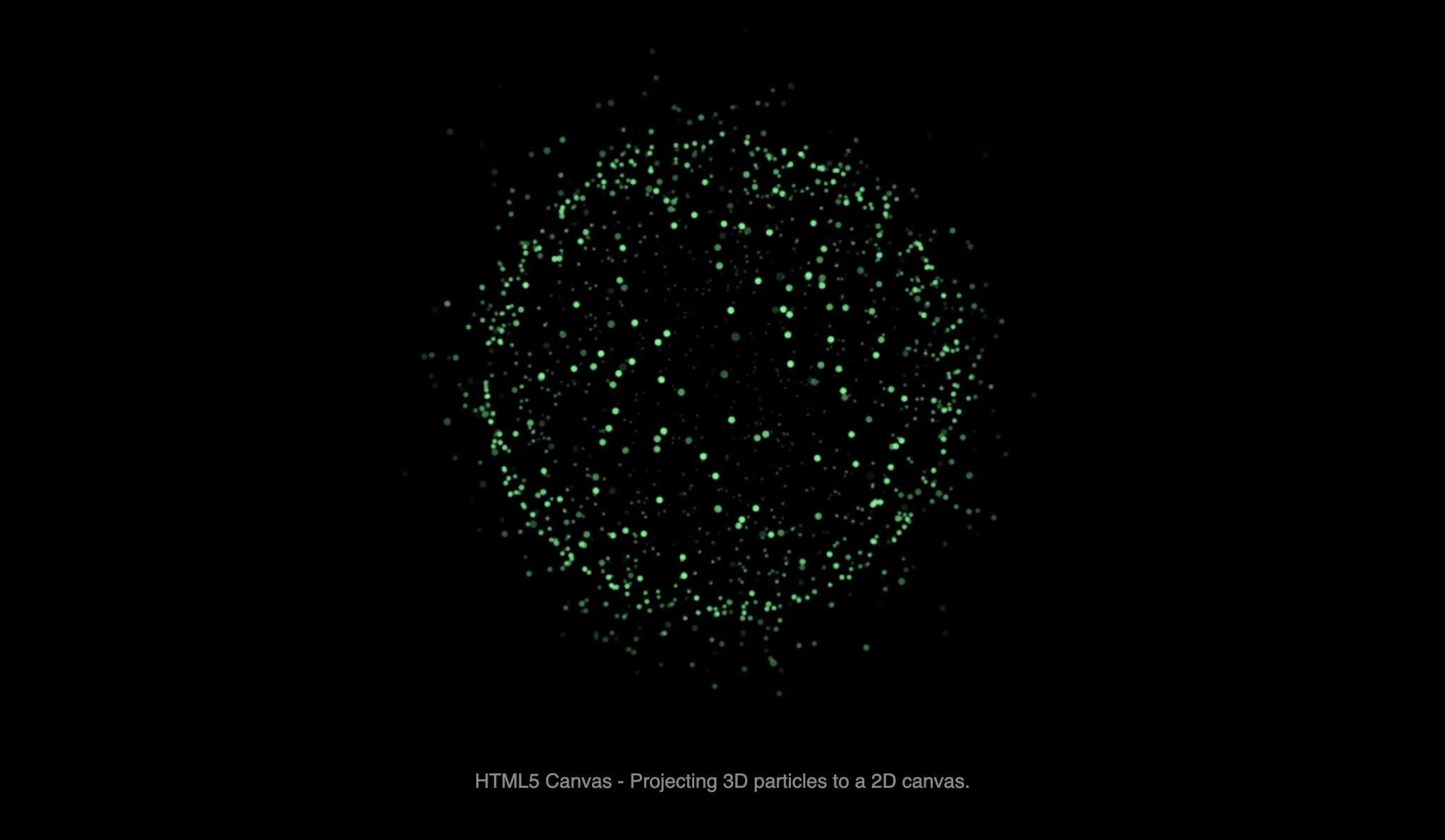
The page showcases a cloud of “particles” that appear three-dimensional even though they are rendered on a flat 2-D \<canvas> element created entirely with CSS. Depth is faked through layered box-shadow, perspective transforms, blur filters, and parallax-style keyframe animation. As the user moves the pointer or taps the screen, subtle CSS transform: rotate3d() and translateZ() illusions make particles drift toward or away from the viewpoint, giving the sensation of floating in space.
The build weighs under 8 KB, is fully responsive, and demonstrates advanced modern CSS features—ideal material for teaching visual effects without JavaScript.
What you’ll learn
| Goal | Technique |
|---|---|
| Simulated depth | Multiple concentric box-shadow rings & filter: blur() |
| Particle drift | @keyframes with translateX/Y and staggered animation-delay |
| Interactive parallax | :hover / :active states combined with perspective on the parent |
| Performance | Compositor-only transforms to keep frame rate high |
| Accessibility | Reduced-motion media query to disable heavy movement |
| Last Update | 12 Sep, 2025 |
| Created | 18 May, 2025 |
| Technology Used | Html Css Javascript |
| Compatible With | Any Browser |
| Documentation | No |
| Layout | Responsive |
| Total Download | 19 |
| Total Views | 99 |
| Tags |